|
Size: 3070
Comment:
|
Size: 3075
Comment:
|
| Deletions are marked like this. | Additions are marked like this. |
| Line 41: | Line 41: |
| Here, the two snakes are separated and used as walking sticks (reference to Sherlock Homes and Watson). | Here, the two snakes are separated and used as walking sticks (reference to Sherlock Holmes and Dr. Watson). |
Logo Examples
Official Logos

This comes in multiple variants: a) with text "python" using the Flux Regular font, b) just the logo device (the two snakes), c) with or without the drop shadow under the device. The eyes of the two snakes logo are either white or transparent, depending on what fits best. On the python.org website, the eyes are white.History behind the less rounded version of the logo
Apparently, the originally presented logo did not yet have the rounded plus shape, but more of a squarish style.
Derived Logos
Carl Trachte's collection of Python logos in the wild
Note: Not all of those have been approved by the committeehttp://nz.pycon.org/Kiwi PyCon Logo
Nicely shows how to separate the original logo device shape from the rest of the logo image.
Note: This is a borderline case, since part of the logo is cut away.
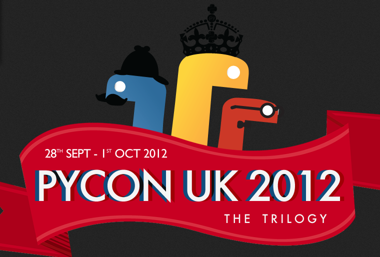
Here, the two snakes are separated and used as walking sticks (reference to Sherlock Holmes and Dr. Watson).PyCon ZA Logo (Twitter account background)

Shows both the main logo which uses different colors and the Python logo (correctly) embedded into other shapes, as well as some dancing Python snake heads which are similar to the PyCon UK ones.
Inpired by, but not derived logos
Problem cases
History behind the less rounded version of the logo

This was found by Carl, but is apparently not being used (anymore). It is a derivative which clearly changes the shape. While it looks really nice, it's unfortunately, not compliant with our trademark policy.


